Abhishek Panda
April 1, 2018
6 min read
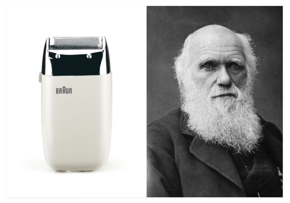
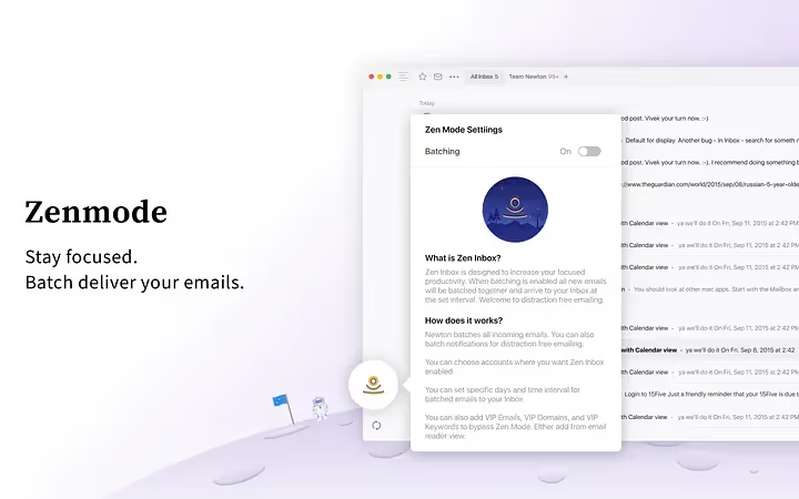
At Newton, we have been staunch believers of minimalism and its power of simplicity (why, we could worship it!). Our intention has always been pegged on this belief. This is what made our app, period. This is what made Newton into everything we know it for; clean & beautiful, easy to use, and clutter-free. All our users have tremendously benefited from using Newton by having this distraction-free and zen experience with emailing (and its much underestimated influence over our life in general).
We live in a time where concepts and positions are constantly evolving; ever more rapidly now than before. Although we see ourselves as being opinionated and having a strong stance, we also see that being adaptive trumps everything at the end of the day. Change is change. You got to acknowledge that. After all, evolution is a natural progression. Either you crumble under the pressure of changing times by holding on to old and stale ideas, or you adapt fluidly to it. Sometimes, this adaptation can go against one’s core values and views. But in a world where money and social likes are a means to an end, you need to seriously factor in these parameters.
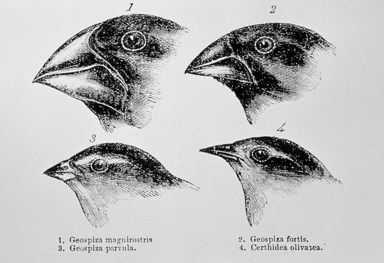
After consistently receiving similar feedback from our users, we considered seriously studying and looking at ways to implement them (Honestly, it would have been foolish to ignore such convincing arguements). Below are 6 select examples and our thoughts on them:
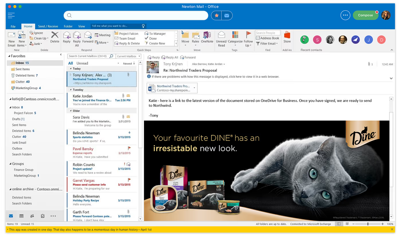
- @jessie98 (Android user): It might be against Newton’s philosophy, but a complex app can attract more interested users. Complexity looks more intelligent and hence ‘feels’ good. Ultimately that’s what sells. Newton’s thought: Fair point. Although we love minimalism, there’s no harm in trying this out. History has shown us again and again that it never ended in a fairytale when a ruler of a country stood by their stuck-up ideas. Now the question is, how can we bring complexity into our email interface in a ‘smart’ and clever way? So, looks like the emperor actually needs some new clothes this time. Hint: Simple or no clothes never looked regal in any case.
- **** (user undisclosed): When there are many elements on the interface (for instance a sidebar that’s always open with multiple panes) you are more productive as multitasking becomes easier. Also, when there are a lot of elements on the screen, an observer (a boss for example) perceives you to be working harder. With a simple, minimal screen, it appears like you’re not doing much. Newton’s thought: Interesting point. We believe in working with the human psychology (specifically the branch that deals with the scientific study of algae) to optimize our product. This one was a classic example for us. We’re convinced.
- @lama123 (iPhone user): Stop trying so hard. Users are not yet ready for the coming Buddhist zen revolution. Newton’s thought: So, maybe later. 😞 We’ve been trying the zen thing for a while now. But it looks like it never really excited a significant user base within the Na’vi tribe (except maybe for the peace-loving Omaticaya clan). Given the context, perhaps introducing a bioluminescent interface could be tantalizing enough.
- @Marketinggenius85 (Mac user): The app is too over-priced for most people, although there are other potential revenue options not exploited by Newton. For example, why not give relevant ad space a fair chance to generate revenue through a different model. There are a ton of blank spaces all over the app that are itching to be used anyway. Income from ads can offset the product cost. This makes more sense than burdening the user unnecessarily with higher costs. Newton’s thought: Newton in our opinion is reasonably priced for the costs we incur. Having said that, we do want the app to be accessible and as widely used as possible. The price shouldn’t be a barrier to that. Exploiting the blank spaces around seems to be the key here. Besides, ad money sounds tempting because we could make some extra bucks too. 😉 Additionally, we can assure users complete security against any ad-bots as we have been colluding with some high ranking Russian cybersecurity officials (Psst, some of Putin’s best men 🤫).
- @Elonmusk (our star user): The app is so zen that it makes life outside seem brutal. Perhaps reversing that can be wiser from a philosophical standpoint. In fact, I follow the same. If you can’t make Earth into a zen garden, inhabiting the harsh environment of Mars could make life on Earth look like church picnic, in retrospect. Newton’s thought: Inculcating a zen lifestyle can be approached from an opposing direction. Dealing with a lot of distractions inside the app can actually eclipse the ones faced in everyday normal life, making everything else seem far better afterwards. It’s all about the contrast! We love Elon!
- @Simoncowell (another star user): Greys and whites have been overdone in Newton. Things are way too monotonous and lack any flavor. Life is about colors and emotions. It’s cold and grey in here (much like British weather). Newton’s thought: All arguments in favor aside, eventually, a cold and muted-grey color palette does get boring after a point. We admit to that. Colours are fun. Nobody wants to work inside a dull space, especially in today’s Netflix-Alcohol-Rainbow-Kardashian era. Newton needs to satisfy the majority audience seeking a vibrant atmosphere and instant gratification.
With all this enriching feedback, we went on to see where and how we could make Newton reflect this unique new wave of thinking ushered in by the users themselves. Over the past few months we have been designing and building prototypes which we wish to share for further feedback. After all, Design has always been an ongoing and collaborative process here. We wish to make the most of it by incorporating what the users actually want (unlike Apple that will make the users helplessly desire that which they never even wanted).
Below we’ve shared a work-in-progress screen of the new design. As you’re already familiar, we truly value your exceptional ideas and feedback. So, please feel free to leave your comments and suggestions right below.
🥁
.
.
.
.