Francesco D'Alessio
October 23, 2017
2 min read
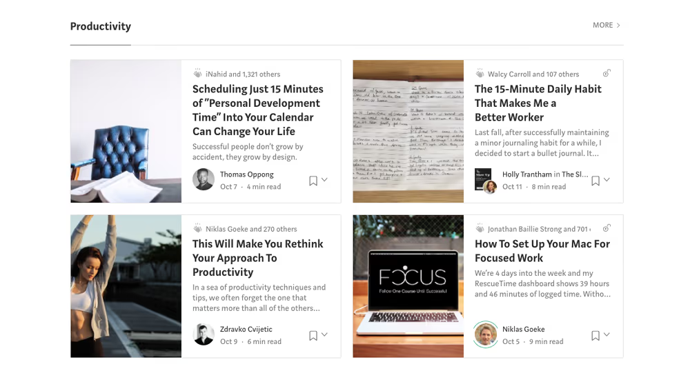
Last week, you may have noticed Medium’s new font.
The rollout of the new Medium brand brought lots of new updates to the logo, style and brand guidelines of Medium. The last 6 months has been huge for Medium and this new headline font changes things.
For someone who adores fonts, Medium’s change to the font has impressed me as a writer on Medium and as a reader.
So what’s new with Medium font!?
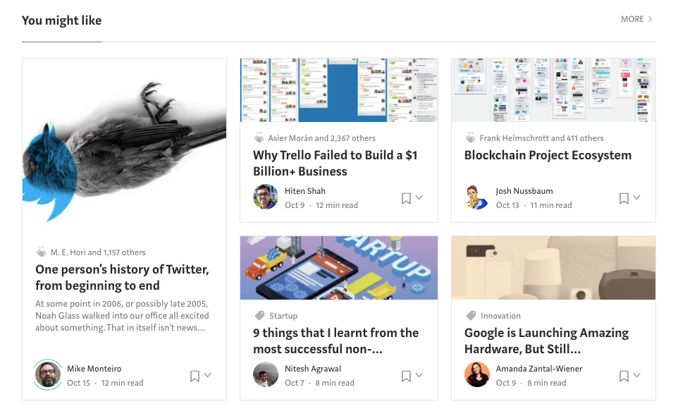
Header text across Medium has been refreshed. A stronger font, the new typeface looks more structured on the new article headers, sub-title text and spread out across the site giving it a more professional and credible feel.
With this design overhaul, it does feel like Medium is aiming to be a reputable resource for writers and journalists.
With this new font change, this is reflected in the writing experience, as I write the new headers look crisp and easier to follow.As a reader this upgrade the flow of reading by accenting the elements of text, making articles easier to read and titles more attractive to click on.
Where to find the new font!?
Let’s take this article for an example.
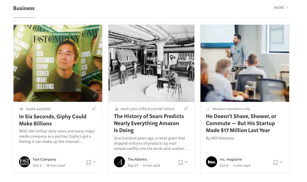
You will find the new font dotted almost everywhere.
- Title Text
- Header Text
- Preview Text
- End of Article Recommendations
- Profile Bio segment
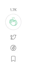
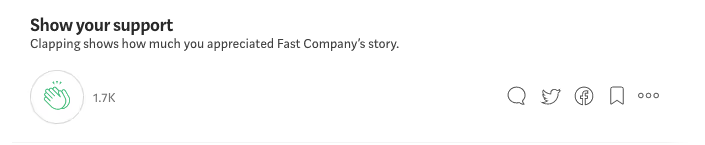
- Clap iconography
- And so many more spots…
Here are just a few of those new representations in the article:


Opinions
As you can tell, I’m a fan. The subtle update brings a fresh look to the font, giving it better readability and access. From reading tweets on the newly updated font, the reaction seemed mixed, here are a few that came out about the new Medium font.
Just a handful of the reactions!
What do you think of the Medium font? Share your comments below!
Love design and brilliant UI?! Try Newton. A beautiful emailing experience.
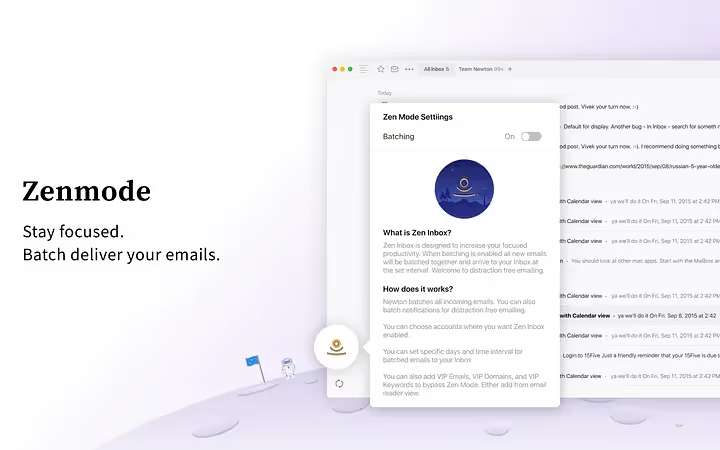
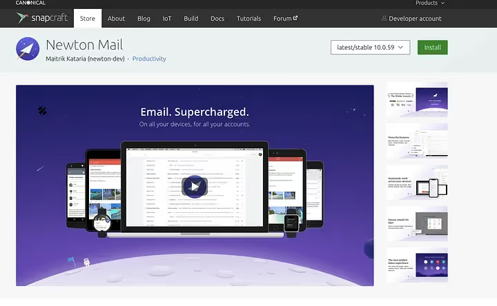
Newton is one of the leading email apps on iOS, Mac, Android & Windows. Combine this stunning design with features like Read Receipts, Undo Send and even Tidy Inbox to reduce clutter, you’ll be at Inbox Zero in no time.
Follow me and Paper Planes on Medium for more articles.