Abhishek Panda
August 4, 2017
5 min read
Pure logic argues that, when there is nothing to show, you show nothing. But as part of a larger comic strip and an even larger story book, this becomes a blank, repetitive and lifeless frame. In effect, more tragic than comic. Either way, without going all Socrates on this, a blank frame has close to no personality to appeal to and virtually nothing to look forward to. Putting that on loop could stimulate borderline depression in some people (if someone takes a liking to it, we do have an evolutionary anomaly). Surely, purely rational choices are boring. A little emotion in those cold empty corners brings warmth and adds that human touch (might sound like a broken record, but anyway).
In a way, using an app is like being in a story. There is a plot with a narrative, interspersed with breathing spaces and pauses. To us, it was never really a matter of filling in these empty spaces just for the sake of occupying them. In fact, that would be sacrilege because, breathing spaces are beautiful, providing asylum from the chaos. Preserving these blank space sanctuaries without polluting them was essential. So then, it was clearly a matter of finding the right balance.
Breathing spaces are beautiful, providing asylum from the chaos. Preserving these blank space sanctuaries without polluting them was essential.
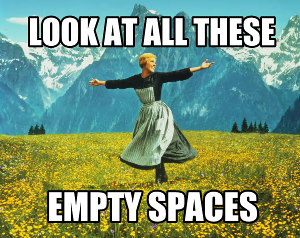
We are all too familiar that a lot of thought and effort goes into designing the experience of an app. But very few apps take their empty-state-experience seriously. Like seriously! Even fewer take it up as a serious project. And fewer still make it their goal to bring joy and meaning through them. At Newton, we have always felt strongly towards such smaller details. These might be momentary states, but they can help generate strong affinity and emotional connect to a product. Let’s just say that we like to see our users bond with our app (not in the creepy Human-AI way). Think of it as just a very comfortable place to work out of. Point being, the ‘positive vibes’ induced would only (erm) increase productivity.
These might be momentary states, but they can help generate strong affinity and emotional connect to a product.

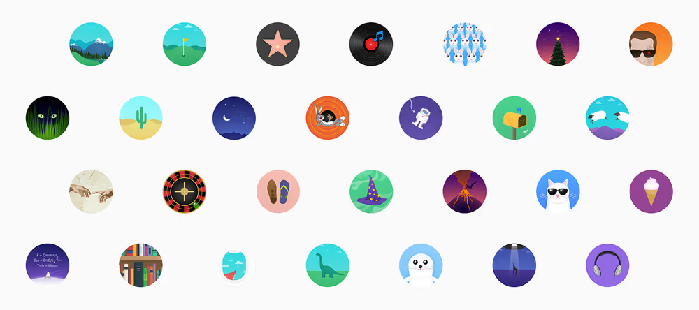
With this clearly ingrained in our minds, we put in many months planning, ideating and conceptualizing. Finally, we went ahead and executed a set of illustrations, each coupled with tailored-to-fit micro-copy. Now that might come as no surprise. App aficionados to regular Joes may wonder, ‘So what?! Every other app does that these days’. But more apps today create empty states robotically with predictable ideas. Somewhere a lack of sincerity is prevalent. They almost seem like textbook guided empty-state-fillers. However, our goal was to bring a smile instead of leaving a raised eyebrow. We wanted to keep it genuine. After all it needed to prove itself to ourselves first. Our recipe — an element of open interpretation, a hint of meaning carefully seasoned with a degree of subtle humor — all within the context, such that our users would relate to it too.
When an image comes packaged with words, it draws much attention and emotions. Something dramatic and delightful radiates from their marriage. While the image goes out speaking a thousand words, the words coupled alongside simmer down the ramble in the head and help focus on a point you intend to make with the very image. Ok, I admit that’s excessive deconstruction for something fairly simple. You already get the point. So, without pushing the word-count any further, here’s allowing the empty states to sing for themselves (Yes, I much prefer to call it music).
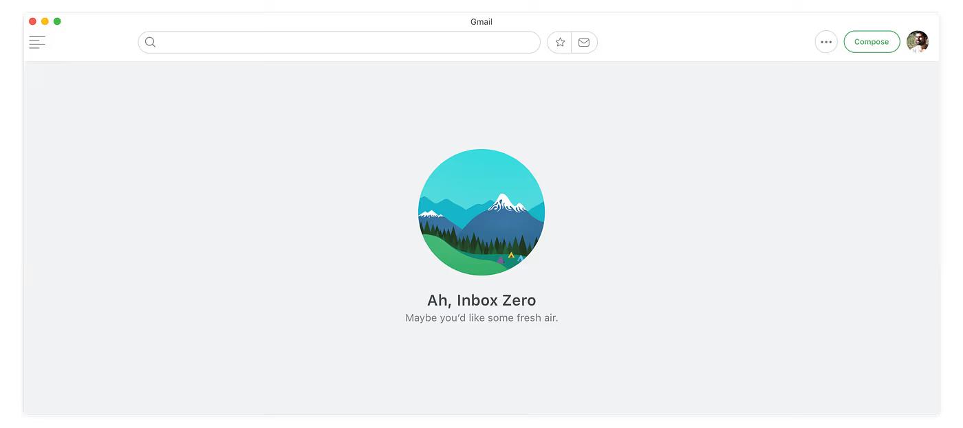
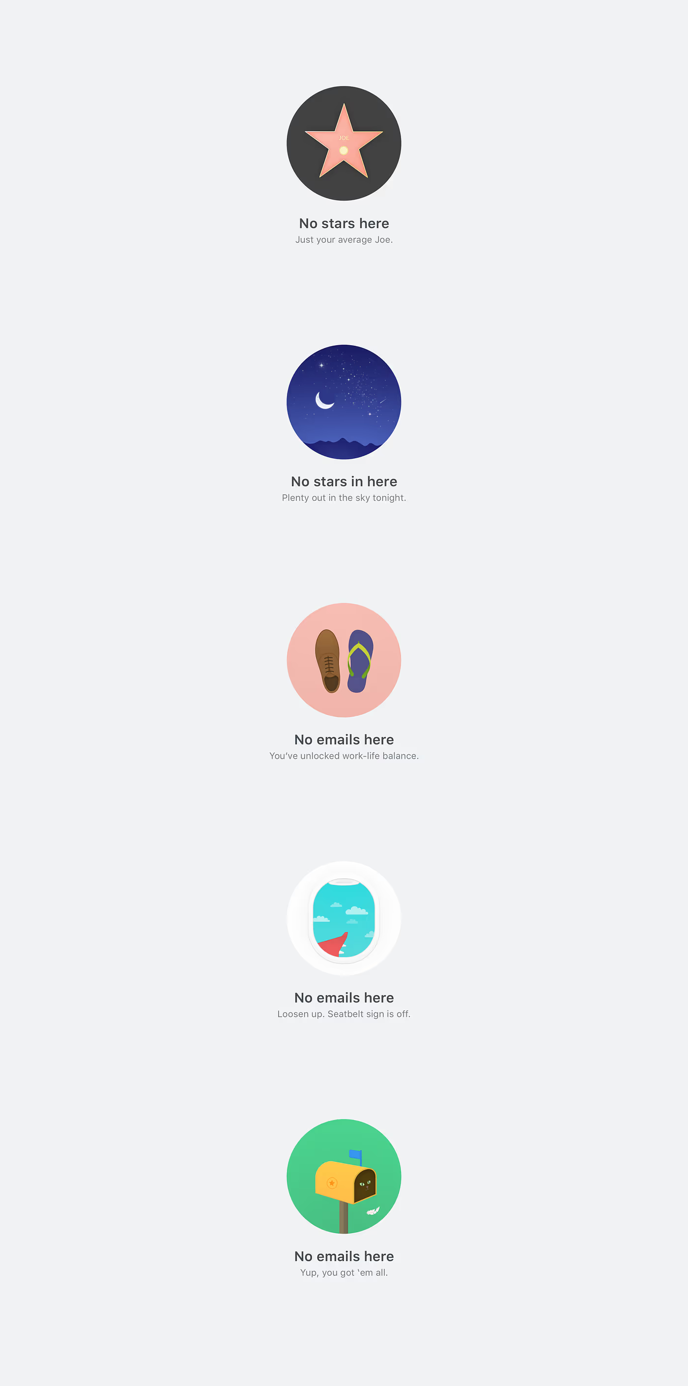
Inbox Zero
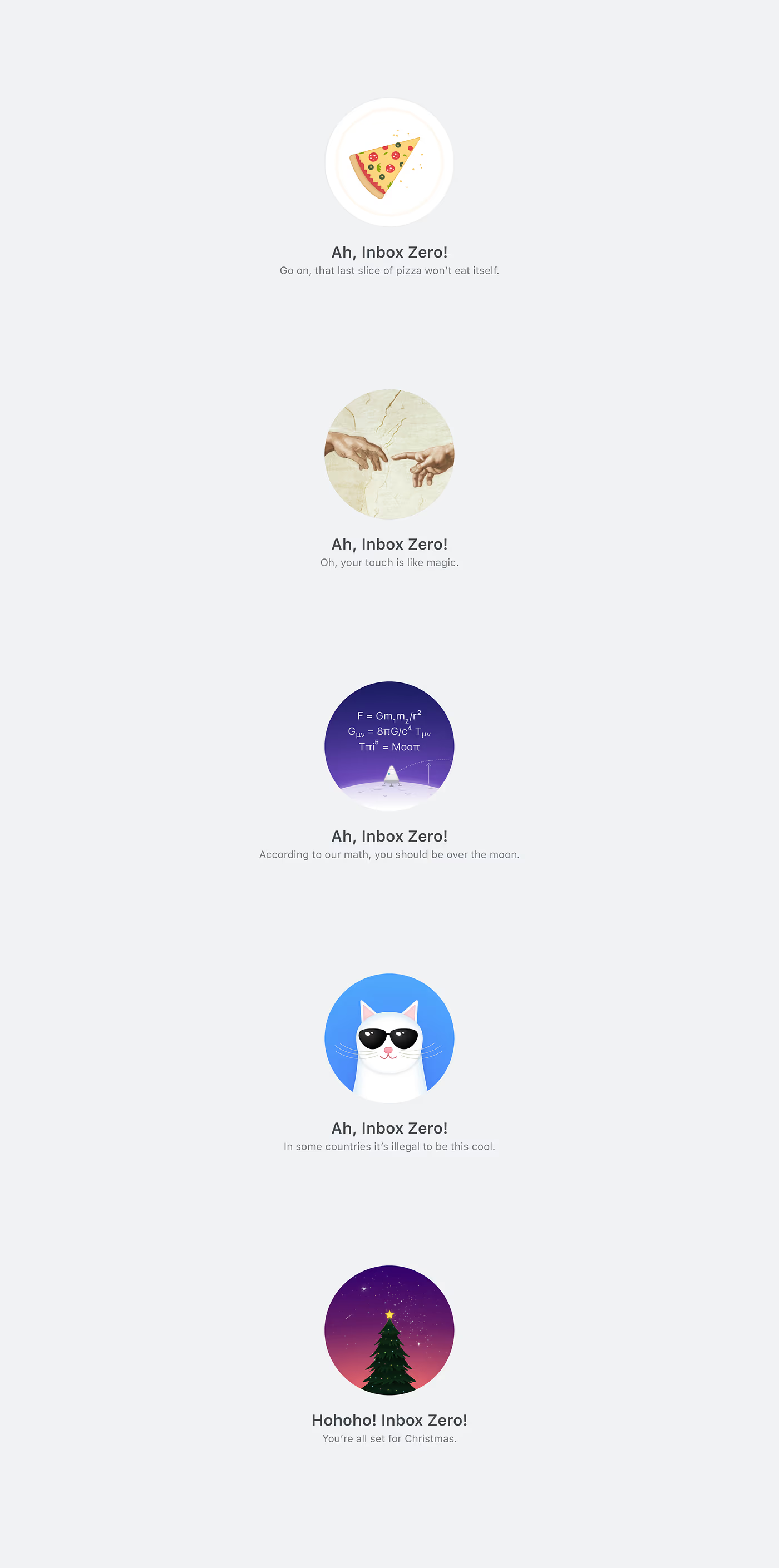
Unread Emails Filter
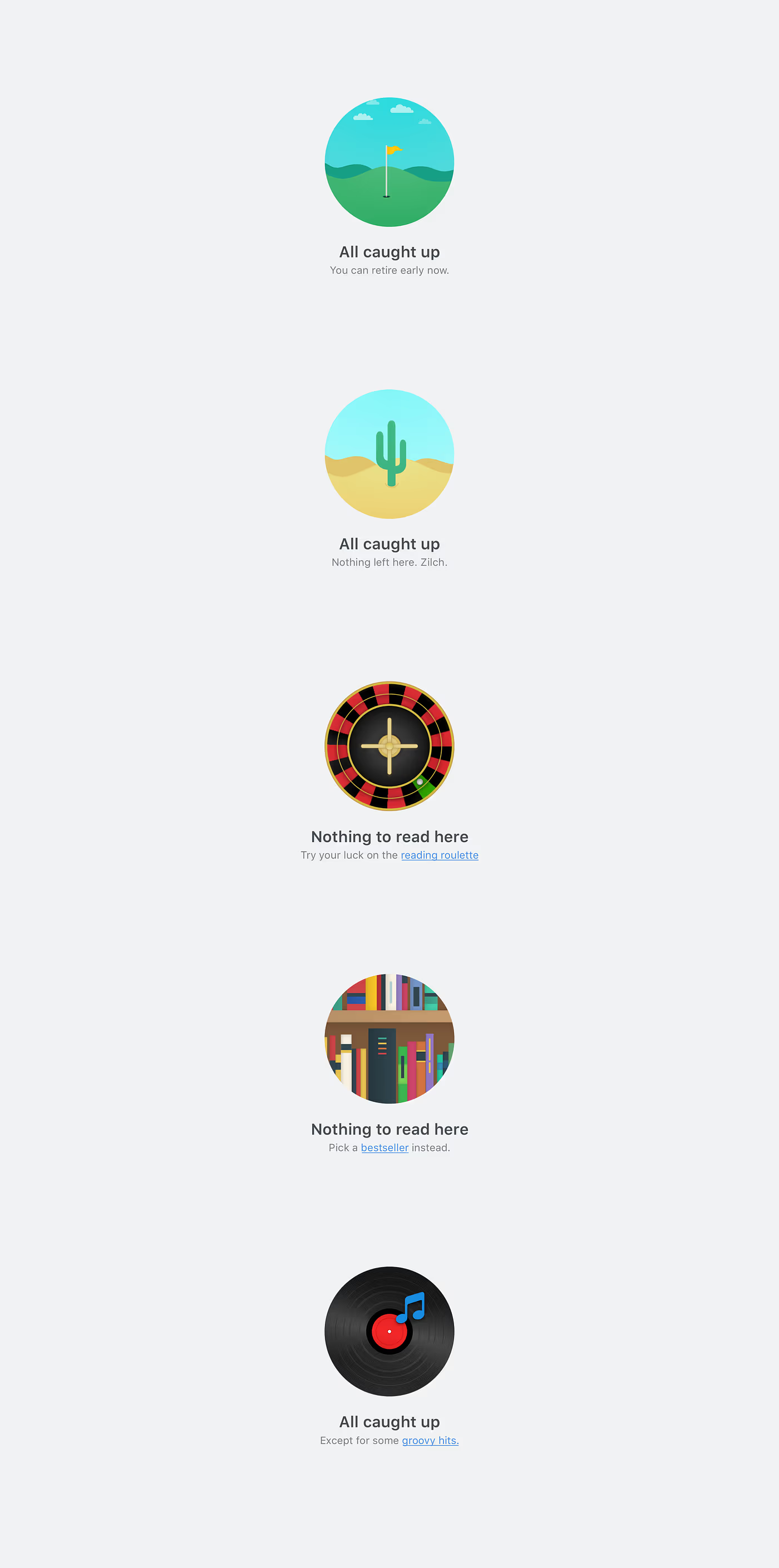
Starred Emails Filter
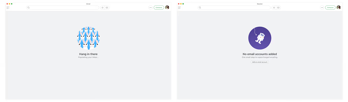
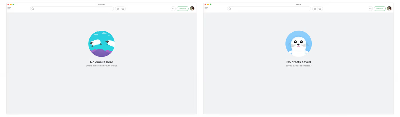
Initial Sync, No Accounts added, Snoozed and Drafts folders
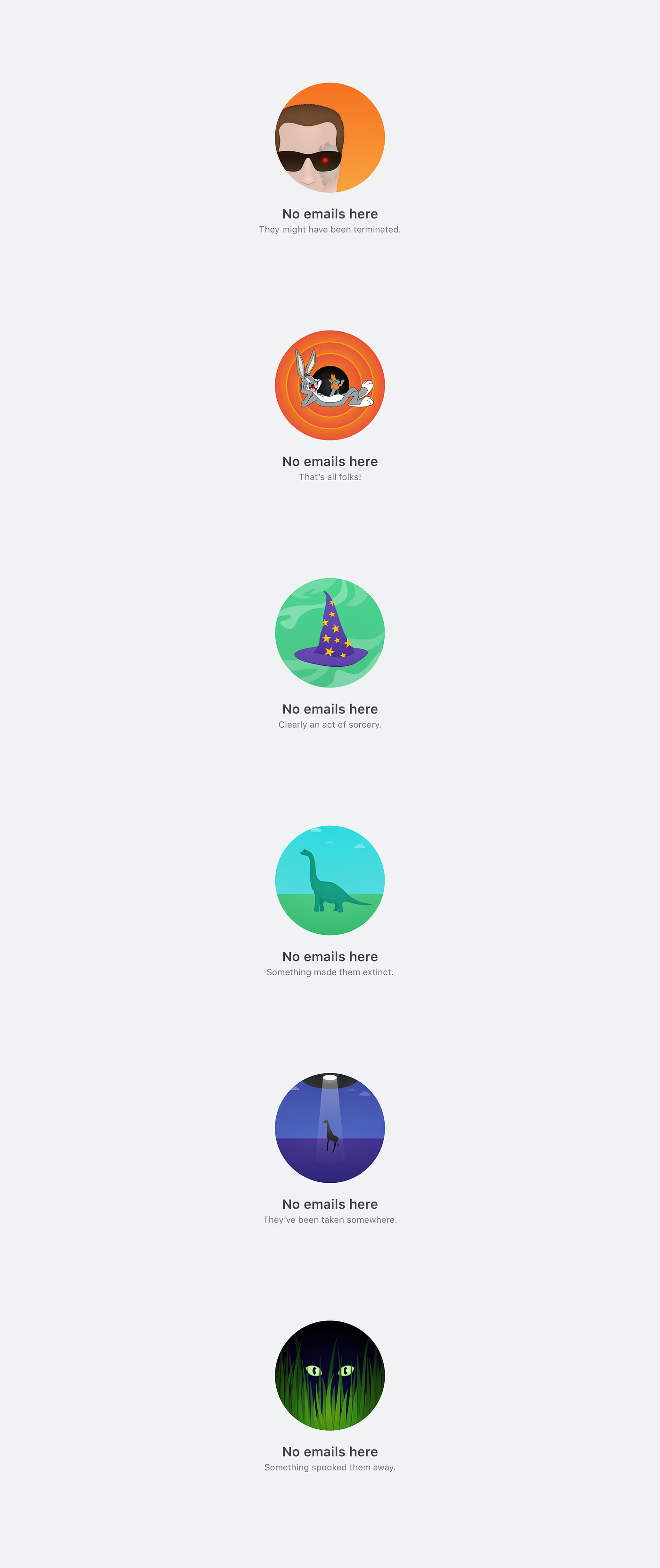
Other Empty Folders
This being my first attempt at a vector illustration series, any kind of feedback is most welcome. :)
P.S. Thanks to Umesh for the direction and the rest of the team at Newton Mail for their quality feedback in helping the visuals come to life.